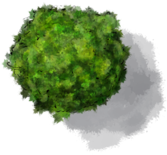
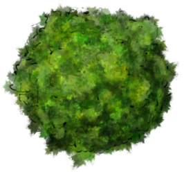
Today I’m walking through my method for colouring trees quickly for RPG maps. This follows on from this mini-tute/discussion on different tree styles from last week. I’m working with style 1 from that tutorial here, though it can be directly applied to the other styles just as easily.

The problem with trees is the leaves. You can’t just draw a green sphere and call it a tree, because we know trees are detailed objects with lots of leaves. Equally you can’t draw every leaf as it’ll drive you crazy, and your players won’t appreciate it. So the trick is to give the impression of detail without painting every single leaf. This is where custom brushes come in. I’ve covered how to create a grungy brush in photoshop and in Gimp. We’ll be using those brushes for today’s tutorial.
With this brush, we now jump into the tree itself.
- Pick two colours, different shades of green for a summer tree, different shades of orange/red for an autumn tree. In Brush Dynamics, set Color Dynamics to jitter the foreground/background colour, and also add in some random variation on each of the hue/saturation/brightness values. Also add in some scatter. Now use this brush to paint in a colour layer as a base for your tree. The colour jitter means that you never paint with the same colour twice. The scattering means your brush layes down lots of independent overlapping jittery patterns.
- Now we’ll give the impression of leaves, and some general shape and form. Add an overlay layer, pick a dark blue for the shadows and a light yellow/white for the highlights. I’m keeping the scatter, and the jitter on the brush here. As the colour jitter is only 50% foreground/background it means it’ll lay down more of the foreground colour than the background. So with the foreground set to the dark blue (and the background set to light yellow) I lay in large low opacity shapes around the shadowed regions. Build them up slowly and see what the tree starts to look like. When I’m happy with that, I switch the colours round (x on the keyboard for speed), reduce the brush size and increase the opacity to about 60%. Then I work in scattered highlights that give the impression of leaves.
- The last step is to really sell the shape of the tree. Add a soft light layer. Turn off the colour jitter and use the same bright yellow (almost white) with a low opacity to highlight the top of the tree. Switch colours to your shadow hue (dark blue) and build up the tree shadows. Try to follow any contours of the line drawing. Trees aren’t just great masses of leaves – they clump and bunch and have shapes inside the groups of leaves. When you’re happy with this, add a multiply layer underneath the other layers and use a low opacity brush with your shadow he and lay in a cast shadow to bring the tree out of the background.

That’s it! It’s pretty quick, even for lots of trees. If you’re doing a lot of trees, make sure you change colours a little for each one, and give them a wide range of sizes to avoid them looking like cookie cutter copies.
If you’d like to use this tree, the psd file is here and you can also download the png with and without cast shadows. The pngs are CC-BY-NC-SA – so feel free to use these for any non-commercial project.

What program do you use? Is it on a Mac or PC?
I use photoshop on a Mac but all the tricks work (more or less) with gimp. Gimp’s free, open source cross platform. Photoshop is windows and Mac but a little pricier than gimp. What platform do you work on?
I draw my maps by hand. First with pencil then I go over it with ink and in the end I fill them in with watercolor and colored pencil.
I have not tried using Photoshop for drawing maps but I have Photoshop CS.
It’s a similar process with PS. FIrst ink the lines using a hard black brush – you have multiple layers so you can do this over and over until you get it right. Then colour using large low opacity brushes (the watercolour stage). I’d recommend picking up a cheap tablet to try it out. Using PS with a mouse is a nightmare. I’d recommend one of the Wacom Bamboo range for starters. I’ve moved up to an Intuous – a bit expensive if you don’t now whether you’ll use it or not, but they are great tools.
Okay, I also have one of the Wacom Bamboo tablet and pens (it is wonderful), I do a lot of graphic art for my blogs and web site ( juleahkaliski.com ), that is how I use my tablet, comes in REALLY handy.
I just published a Tumblr post with some photos of a map I drew of Narnia.
http://juleahkaliski.tumblr.com/post/18140457754/map-of-narnia-drawn-by-juleah-kaliski
I’ll have to try drawing a map in Photoshop. Sounds fun.
Very cool! You should definitely try working up a hand drawn map with your Bamboo – I think you’ll be pleased with the results.
🙂
Hi Jon,
Love your website. Started drawing maps recently for my D&D campaign and currently working on a map where the encounter will have place on the parapet of a castle wall. Since the grass area was completely empty, I wanted to add a tree or two.
I’m currently having difficulty with step #2. I have my base layer looking very close to what you have on layer 2, but I just can’t get something remotely close to layer 3. I think I got the shadow part with the dark blue ok, but doing the highlights is killing me.
Here are my settings: light yellow (feffc3), dark blue (053762), highlighting at 60% opacity; size jitter 0%, control Off; angle jitter 100%, control off; scatter 250%, control off; count 1 and count jitter 0%; fore/back jitter 35%, control Off; Hue/Sat/Bri same as your screenshot. My layer is in overlay mode, 100% opacity and fill.
I’m using a grungy brush from the set your suggested, but why I try to put in the highlights, the contrast is so drastic it just doesn’t feel right.
Any suggestions?
Sorry for the late reply. Can you post a link to an image – ideally at each step – so I can see where you’re going wrong?